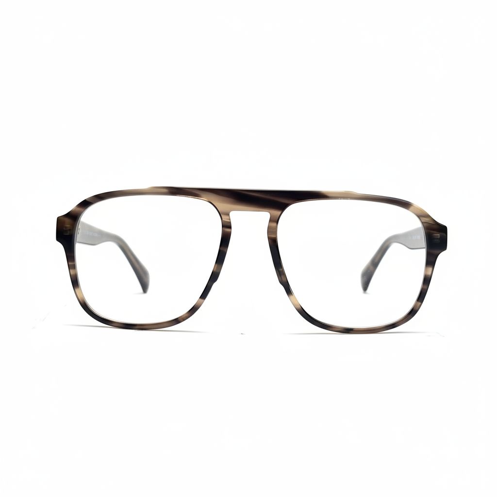
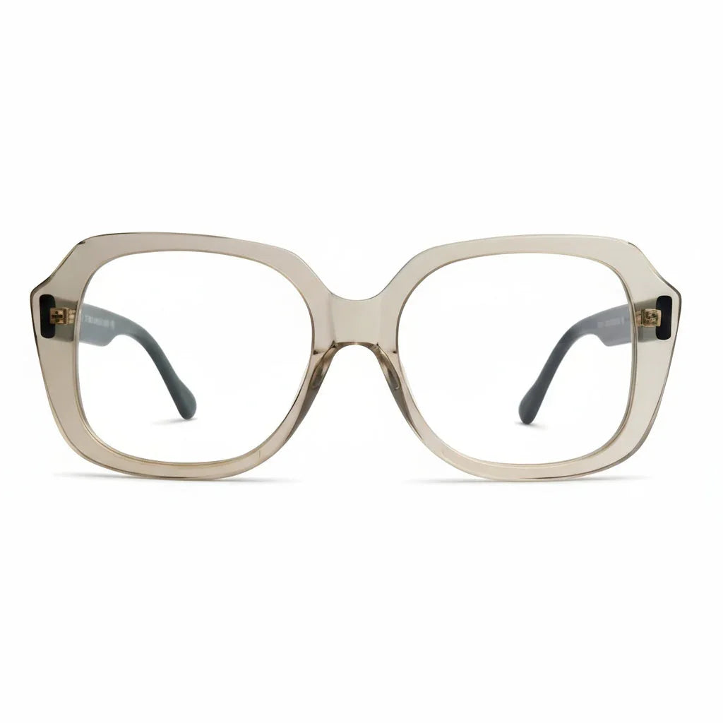
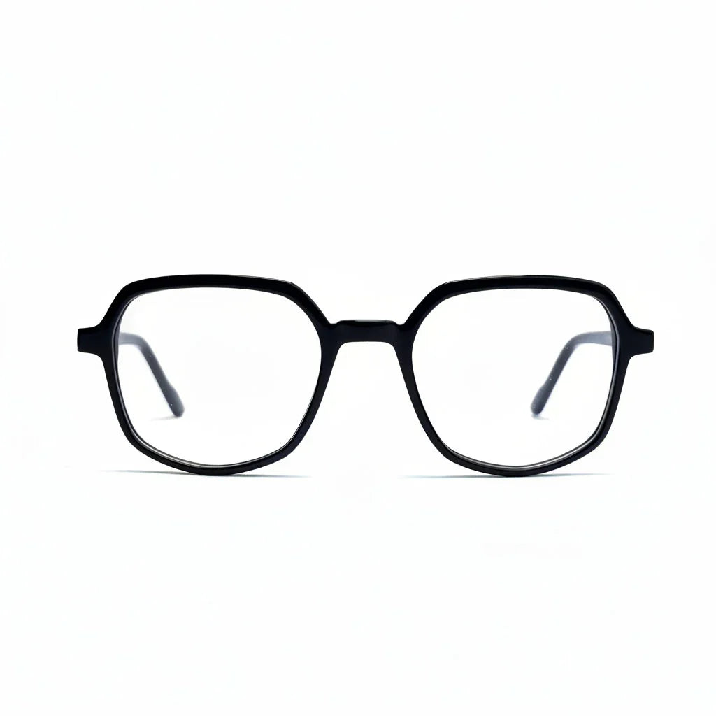
Most sunglasses are bought in the wrong order. The frame gets chosen first — shape, colour, how it looks in the mirror — and the lens, the part that actually sets the mood of your day, gets picked last or not at all.
The result is the small regret you see all over r/glasses: someone posts a photo of a new pair and asks whether to return it. The frame was right; the tint was not. Lens colour is nearly impossible to change later, so it deserves to be the first decision, not the last.
Start with the lens, not the frame
Sunglasses are a filter you wear for hours, and the tint is what that filter does: two identical frames can give you two completely different afternoons. One keeps a beach looking like a beach; the other turns it into a photograph.
r/eyewear regulars make the same point from the other direction. A shopper buying inexpensive "first copy" sunglasses described the moment the difference became obvious, and it was not the branding — it was "the weight, the finish and the clarity of the lenses." Clarity and tint are the two specs worth knowing before you spend anything.
The four lens colours, and what each one does to the scene
Lens colour is a cast laid over everything you look at.
Grey: the neutral
Grey lowers brightness without shifting colour. A red jacket stays red and a blue sea stays blue. It is the safest single choice, which is why grey is the listing default — usually named Black Grey or HC-40-Grey.
Brown and amber: the warm option
Brown and amber push everything warm. Greens deepen, stone looks richer, and the scene picks up the feeling of late afternoon. It does the most for holiday photographs, and it flatters a warm-toned frame — honey, tortoiseshell or amber — because frame and lens then read as a single object.
Green: the classic middle ground
Green sits between the two. It keeps foliage and skin close to natural while relaxing the brightest part of the day — the reference tint for decades. On a listing it appears as Green Grey.
Blue, purple, red and rose: the fashion tints
These deliberately tint the world. Blue cools a scene to steel; purple lays a faint lilac over grey pavements; red and rose warm the skin. They photograph beautifully but narrow the outfits they suit — treat them as a second pair.
Gradient versus solid: what the "Grad" prefix tells you
A sunglass listing uses two kinds of tint name. A solid tint — HC-3-Brown, HC-2-Black Grey — is the same depth from top to bottom. A gradient tint, marked Grad, is darker along the brow and lighter toward the cheek.
The difference is practical rather than decorative. A gradient keeps the upper part of your view deep while leaving the lower half clear enough to read a menu or a phone without taking the glasses off. It also lets more of your face show through, so gradient lenses photograph softer. Solid tints suit a whole day outdoors; gradients suit a day that moves between inside and outside.
Consider the Breezy — a round acetate frame in clear or saturated colourways with our widest gradient selection, from faint lilac to deep purple. A round, clear frame is the easiest way to wear a fashion tint: nothing competes with the lens.
Tint depth: the one-to-four scale
Depth matters as much as colour. The industry grades it one to four by the share of visible light a lens lets through.
- Category 1 — roughly 43–80% transmission. A light tint for overcast days, city shade and late afternoons.
- Category 2 — roughly 18–43%. The everyday middle ground: bright days, commuting, driving.
- Category 3 — roughly 8–18%. The standard holiday tint for beaches, boats and open roads.
- Category 4 — roughly 3–8%. Very dark, built for high altitude, snow and open water — and too dark to drive in.
If a listing gives you a code instead of a percentage — HC-2, HC-3, HC-40 — read it as that tint's reference depth and check it against the scale above. Depth should follow the light you actually spend time in, not the season on the calendar.
The same tint looks different in a different frame
A frame changes where the dark edge of the lens falls across your face, so tint and shape are chosen together. A cat-eye carries its width at the outer top corner, which lifts the tint's line. A round frame spreads the tint evenly and reads softer. A rectangle concentrates colour on one horizontal band.
The Arvid cat-eye takes the lifted approach on a black frame, with a full ladder of tints from Black Grey through Green Grey to Blue Grey. Black absorbs colour rather than adding it, so the tint does all the talking.
If you would rather the frame did some of the work, the Astrid in honey brown pairs a warm frame with amber and brown tints, so the lens looks built in, not added. The Birk follows the same logic in a deeper brown.
Acetate versus polycarbonate: the frame side of the decision
"Acetate vs polycarbonate frames" is one of the most searched phrases in eyewear, and it is worth being precise: the two words describe different parts of the same pair.
Acetate is a frame material. It arrives as a solid sheet, gets cut to shape, then tumbled and polished for days. Colour runs all the way through it, which is why tortoiseshell acetate has depth you can see into. Polycarbonate — and relatives such as TR90 — are injection-moulded: formed in a tool, lighter, uniform in colour. As a lens material, polycarbonate is the impact-resistant option. So one pair can honestly be an acetate frame with polycarbonate lenses.
For sunglasses, acetate takes a deep polish and a saturated finish; a moulded frame is the practical choice for sport and very light wear.
A sixty-second check before you commit
- Level the gradient. Hold the pair against a door frame. The top line should sit level on both lenses.
- Look through to a white wall. The tint should be even edge to edge, with no pale patch near the rim.
- Tilt toward a window. Any haze is a surface issue, not a tint issue, and it will not polish out.
- Decide match or contrast. Honey frame with amber lens is a match; beige frame with a purple lens is a contrast. Both work. An accidental in-between does not.
One pair or two?
The usual conclusion in budget eyewear threads: two ordinary pairs beat one expensive one. A neutral grey or green solid covers work, commuting and everyday weather; a gradient or fashion tint covers photographs, evenings and holidays.
The Ebba cat-eye is built for that role: ten tints on one black frame, so the pair changes with the outfit rather than the other way round. Store both in a hard case, not a bag pocket, and the tint will stay even for years.
Choosing by lens first is a small change of order that makes the frame decision easier. Pick the tint for the light you actually live in, then the shape that carries it.